Note
Go to the end to download the full example code.
Simple Navigation Chart
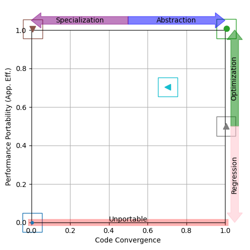
A simple navigation chart.
The point in the top-right corner represents the ideal, where an application achieves the best performance across all platforms of interest using a single source code.
The point in the top-left corner represents applications that achieve the best performance across all platforms of interest, but do so without reusing any code.
Any point along the x-axis represents an application which is unportable (i.e. there is at least one platform of interest where it does not run).
Real-life applications are expected to lie somewhere between these extremes.
A navigation chart is a useful way to visualize the trade-offs between performance (portability) and programmer productivity, assisting in navigation of the P3 space and reasoning about how to reach development goals.

# Initialize synthetic data
# (not shown, but available in script download)

# Read performance portability and code divergence data into pandas DataFrame
pp = pd.DataFrame(pp_data)
cd = pd.DataFrame(cd_data)

# Generate a navigation chart
navchart = p3analysis.plot.navchart(pp, cd, size=(5, 5))
navchart.save("navchart.png")
Total running time of the script: (0 minutes 0.140 seconds)