Note
Go to the end to download the full example code.
Customized Navigation Chart
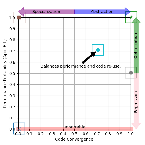
A customized navigation chart.
In this example, we show how to customize a navigation chart by increasing the number of axis ticks and by annotating one of the datapoints. Adjusting the number of axis ticks can improve a reader’s ability to discern between two similar values, while annotations can be useful to draw attention to certain points and/or provide some additional context.
Instead of trying to expose all possible customization options as arguments to
p3analysis.plot.navchart(), the function returns a
p3analysis.plot.NavChart object that provides direct access to library
internals. When using the matplotlib backend it is possible to
access the matplotlib.axes.Axes that were used and subsequently
call any number of matplotlib functions. In our example, we can
use matplotlib.axes.Axes.set_xticks() and
matplotlib.axes.Axes.set_yticks() to control the ticks, and can use
matplotlib.axes.Axes.annotate() for annotations.
Note
matplotlib is currently the only backend supported by the P3
Analysis Library, but this is subject to change.
Tip
If you have any trouble customizing a navigation chart, or the
NavChart object does not provide access to the
internals you are looking for, then please open an issue.

# Initialize synthetic data
# (not shown, but available in script download)

# Read performance portability and code divergence data into pandas DataFrame
pp = pd.DataFrame(pp_data)
cd = pd.DataFrame(cd_data)

# Generate a navigation chart with custom style options
legend = p3analysis.plot.Legend(loc="center left", bbox_to_anchor=(1.0, 0.5))
astyle = p3analysis.plot.ApplicationStyle(markers=["x", "*", "s", "o", "P"])
navchart = p3analysis.plot.navchart(pp, cd, size=(5, 5), legend=legend, style=astyle)

# Further customize the navigation chart using matplotlib
# In this example, we add a label and adjust the ticks
ax = navchart.get_axes()
ax.annotate(
    "Balances performance and code re-use.",
    xy=(0.7, 0.7),
    xytext=(0.2, 0.55),
    arrowprops=dict(facecolor='black', shrink=0.05),
)
ax.set_xticks([x * 0.1 for x in range(0, 11)])
ax.set_yticks([y * 0.1 for y in range(0, 11)])

navchart.save("customized-navchart.png")
Total running time of the script: (0 minutes 0.204 seconds)